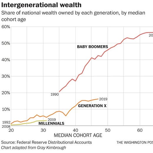
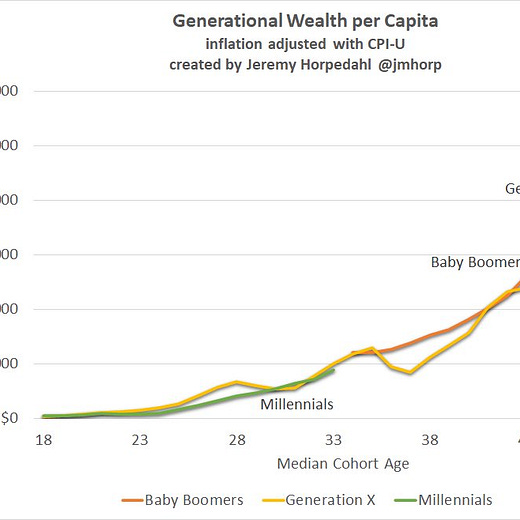
I had not previously realized exactly how weird it was that the first graph has percentages on the Y-axis. Very misleading!
Given how many stories about Fusion power I’ve shared recently, I thought it was super useful that the new XKCD has a refresher on all the hydrogen isotopes.


